Making Audit Data Useful
Turning raw field audit data into something clients could act on.
00

problem
Quest responses were displayed as flat lists with no branch context, and the summary tab had no actual summary data. CPG clients running quests across hundreds of stores had no way to see aggregate results or understand conditional response data without reconstructing it manually.
solution
Made the existing pie chart interactive — clicking a segment filters the task list to show only that branch's follow-up responses. Built a consolidated KPI dashboard with 21 card types, each reframed for summary-level utility, consistent grid layout, and validated at both high and low data volumes.
The Product
InfoQuest deploys field representatives to retail stores for real-time audits — shelf compliance, stock levels, promotional setups, competitive intelligence. Field reps complete structured questionnaires in-store, and the data feeds into dashboards that CPG brand managers use to make operational decisions.
Two Problems, One Root
Two data problems had accumulated in the reporting layer.
Branched data with no visible structure. Quest creation supported conditional branching — a yes/no task could trigger different follow-ups depending on the answer. The report tab didn't reflect it. All tasks appeared in a flat list with no indication of which follow-ups belonged to which branch. Clients had to reconstruct the logic manually. The data wasn't wrong. It was stripped of the context that made it interpretable.
No consolidated view across locations. The report tab showed per-location data only. The summary tab existed but contained no summary data. Clients had no way to build an aggregate picture without scrolling through hundreds of locations manually.
Same root: the product was surfacing raw data without doing the analytical work to make it actionable.
.year
2025
.timeframe
4 weeks · 2 sprints
.role
Solo UX Designer - research, IA, design system, and UI
.team
1 UI/UX Designer (me) · 1 PM · 2 Business Analyst · 1 Architect · 15 Development Team Members
.tools
Figma
.category
B2B Product Design
Feature 1 — Conditional Report Filtering
The fix was interaction design, not information architecture. The branching logic already existed in the data.
The yes/no task already displayed a pie chart showing the response split. The solution: make it interactive. Clicking Yes filters the task list to show only Yes-branch follow-ups. Clicking No shows only No-branch tasks. One click to clear.
The interaction is discoverable without instruction — the pie chart is already present, making it clickable extends a familiar element rather than adding new UI. Earlier explorations used a toggle above the task list; the interactive chart was cleaner, eliminating an extra element entirely.
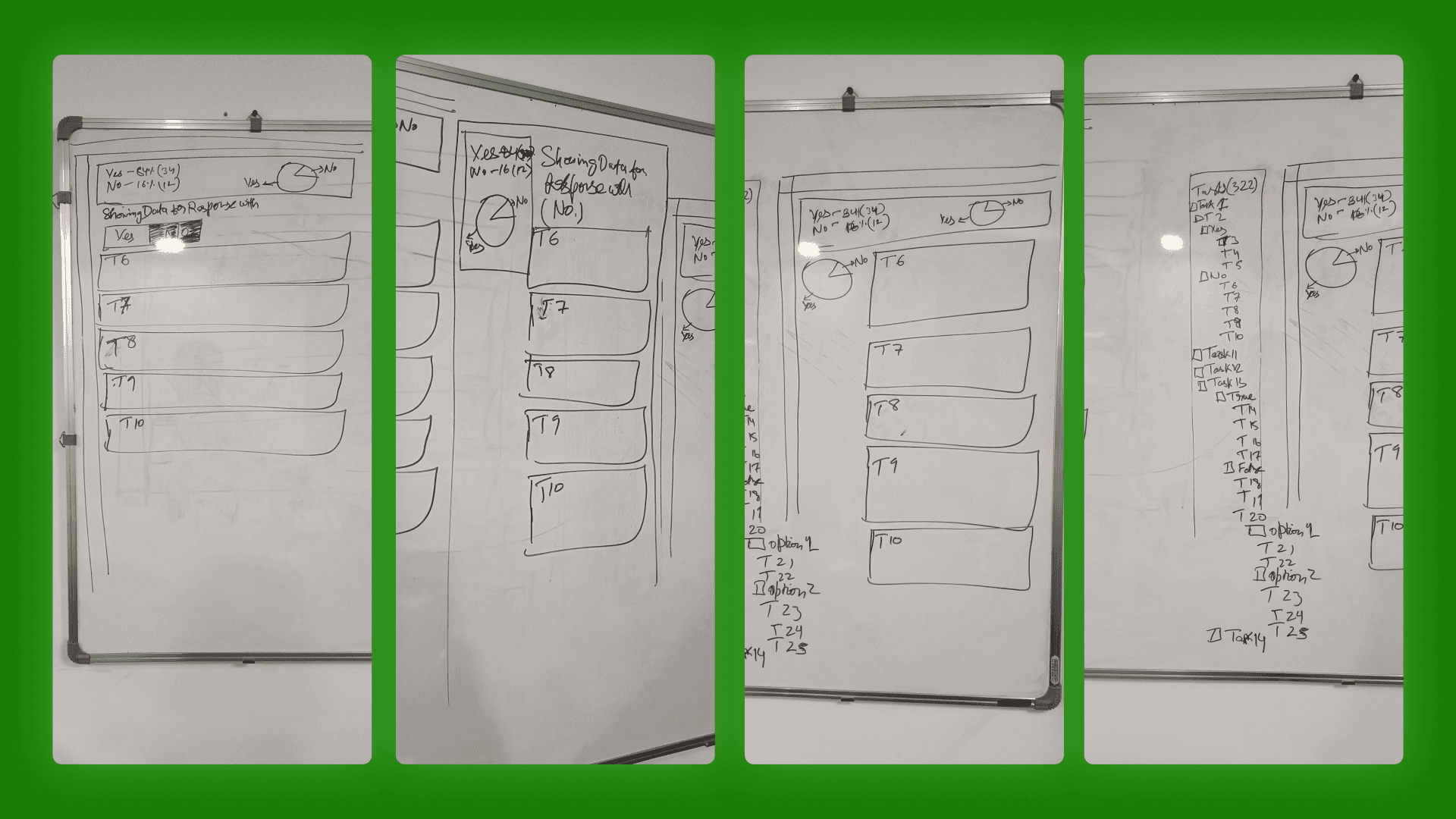
Four iterations on the whiteboard before opening Figma — working out how the pie chart interaction would surface branch logic without adding new UI.
Feature 2 — Consolidated KPI Summary Dashboard
The challenge wasn't what to show — it was how to show 21 different data types consistently at summary scale without losing the signal in each card.
Grouping first. The 21 types fell into natural families: binary, selection, numeric, media, text. Five layout patterns instead of 21 individual design problems.
Data trimming. Not every report-tab metric was useful at summary level. For each of the 21 types, I decided what to keep, what to drop, and whether the metric needed reframing rather than just condensing. These were analytical decisions, not visual ones.
High and low volume states. The architect required two versions of each card — 200+ responses and 2–3. High volume surfaced overflow problems. Low volume surfaced a different one: a card designed for density looks broken with two responses. Each card needed both a truncation strategy and an intentionally sparse low-volume state.
Fixed grid constraint. All 21 cards had to fit the same grid cell. Every data type worked within the same spatial budget, which forced prioritisation on every card and kept the summary view scannable.
How the Two Features Connect
These weren't two parallel features. They addressed the same problem at two different points in the reporting flow.
The summary dashboard answered: what happened overall? Conditional filtering answered: for locations that responded a certain way, why? One is the aggregate view, the other is diagnostic.
A client seeing 40% No responses in the summary tab can click that segment in the report tab and immediately see only the No-branch follow-ups. Before this release: multiple manual steps. After: two clicks.
What I'd Do Differently
Get in front of a client analyst earlier. The data trimming decisions were informed, but made without a real user in the room. A single session asking "what do you actually look for when you open this?" would have validated or challenged those calls with direct evidence.
Map card types to data patterns before touching layout. I arrived at the template groupings through the design process rather than before it. Mapping data structure families first would have compressed the exploration phase significantly.
Run the density audit at the start. The high/low volume exercise came after initial designs were in progress. Doing it first would have made the truncation and overflow constraints deliberate rather than reactive.
Outcome
Two features shipped in a single release. The summary tab became the primary entry point for quest reporting. Conditional filtering resolved a longstanding client complaint. 21 KPI types designed, each validated at high and low data volume, within a 4-week sprint cycle.
01

02

03

04


