Designing for High-Stakes Operations
One interface to monitor and control an entire grow operation.
00

problem
Commercial cultivators had no unified interface to monitor and control environmental systems across multiple facilities. Critical parameters — temperature, humidity, VPD, CO2, PAR — were managed separately, with no aggregate view, no alert logic, and no way to act on data without switching between systems.
solution
Designed a four-level information architecture (Organisation → Site → Room → Device) with a global dashboard for cross-facility health checks and room-level monitoring built around a custom gauge component — displaying current value, set point, operating range, and alert state simultaneously for all five sensor types.
The Product
THC Controls is a SaaS platform for commercial cannabis cultivators in the US legal market — a single interface to monitor and control every environmental system across multiple facilities in real time. HVAC, irrigation, fertigation, lighting, CO2.
The client came from the industry. Experienced growers who understood the operational problems firsthand, building the tool they'd always needed. No existing product to reference or redesign from.
The Users
Commercial cultivation operators managing one or more grow facilities, keeping environmental conditions within precise tolerances across multiple rooms simultaneously. A room running at the wrong temperature or humidity for too long doesn't just reduce yield — it can trigger pest infestation, mould, or crop loss costing tens of thousands of dollars.
These are domain experts operating complex equipment. The design had to match that expertise without condescending to it.
.year
2023
.timeframe
3-4 weeks
.role
Solo UX Designer
.team
1 UX Designer (me), client-direct, 1 BA, 1 PM
.tools
Figma
.category
0→1 Product
Domain First, Design Second
Before touching a screen, I had a problem I hadn't encountered before: I didn't understand the domain well enough to design for it.
VPD, PAR, CO2 enrichment thresholds — these aren't interface labels I could treat as placeholders. They're the core data operators make decisions from. Designing before understanding what these values meant, and what getting them wrong would cost, would have produced screens that looked right but failed in use.
The first step wasn't wireframing. It was learning.
I spent structured time with the client building enough domain understanding to make design decisions independently. By the end, I could articulate why a room showing 2.3 kPa VPD against a 1.6 kPa set point was a problem — and why an operator needed to see that discrepancy instantly, without calculating it themselves. That understanding became the foundation for every decision that followed.
Information Architecture
The platform manages four levels: Organisation → Site → Room → Device.
The Global Dashboard gives operators a cross-facility health check — Total Sites, Infested Rooms, Active Rooms, Alarms, Down Devices, Next Harvest — before drilling into anything specific. Each site card below breaks the same metrics down per location, visible without clicking in.
Twelve navigation sections covered the full operational surface. Each could have been a standalone product. The design challenge was making all of them feel like one system — consistent navigation, consistent data logic, consistent alert behaviour — so operators moving between sections didn't have to relearn the interface.
The Gauge — The Central Design Problem
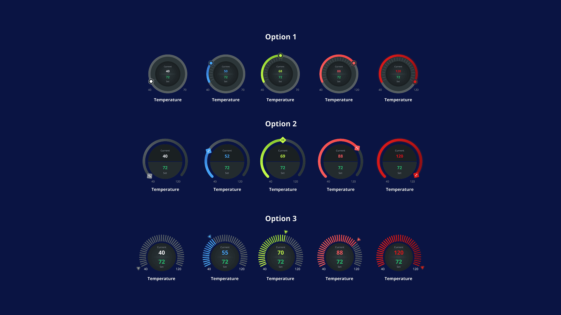
Three directions explored and rejected — not for looks, but because none could flex to handle different control logic per sensor type.
Each grow room displays five parameters simultaneously — Temperature, Humidity, VPD, CO2, PAR — each with a current value, set point, operating range, and alert state. The operator needed to read all five at a glance, know immediately which were within tolerance, and have enough context to act.
Three approaches before the final direction:
Option 1 | Option 2 | Option 3 |
|---|---|---|
Segmented arc with positional marker. Reading the gap between current value and set point required locating two points and calculating mentally. | Diamond set point with arc fill. Better at showing magnitude, but current value and set point became hard to differentiate when close together. | Tick-mark segmented ring, colour-coded across the range. Too small to read reliably at the size five gauges needed to render side by side. |
The final design separates information layers clearly. A continuous colour gradient on the arc perimeter shows range position at a glance. The current value sits large in the centre, colour-matched to its arc position — a red number means out of range without reading the arc. The set point sits below, visually subordinated because it's the target, not the current state. Two adjustable handles set the operating range boundaries — the same component handles monitoring and control simultaneously.
The reason earlier options were rejected: they couldn't flex across different sensor control logic. Temperature has one set point. Humidity has two thresholds. PAR has no traditional set point. The final gauge accommodates all variations without changing its visual language — an operator reads Temperature and Humidity gauges using the same mental model.
Device Management
The device list covers every piece of equipment across a facility, filterable across two dimensions simultaneously — by room and by device category. An operator troubleshooting a CO2 issue in Flower 2 isolates exactly that subset in two clicks.
The device detail screen sequences information by priority: operational status first, current readings, configuration parameters, historical trends. An operator checking a flagged device answers "Is there a problem right now?" before "How is it configured?"
Fertigation
Where room gauges dealt with continuous sensor values, fertigation dealt with discrete states — valves open or closed, tanks filling or not, modes manual or automatic.
Each valve has two states: a manual on/off toggle and an Auto checkbox that hands control back to the SOP schedule. The relationship between these two states had to be unambiguous — an operator believing they'd set a valve to Auto when they hadn't has real consequences for nutrient delivery.
The Target vs Actual table per tank card — pH target 7.2 / actual 6.8 — gives operators an immediate gap assessment without requiring them to interpret a chart.
What I'd Do Differently
Get direct access to at least one operator. Everything I understood about real facility use came through the client. His domain expertise was the project's strongest input — but one observational session watching an operator through an actual shift would have surfaced workflow patterns no briefing captures.
Validate the gauge at real rendering size in round one. The exploration happened at comfortable design scale. The five-gauges-side-by-side constraint only became real when I placed them in context. Testing that earlier would have eliminated options faster.
Treat the SOP interface as a primary design problem. The automated scheduling layer — controlling when devices turn on and off — was designed to lower fidelity than the monitoring screens. In a system where everything depends on automation running correctly, it deserved the same rigour as the gauge.
Outcome
120+ screens shipped across a 3–4 week greenfield timeline. One reusable gauge component handled five distinct sensor types with different control logic, no visual inconsistency. Full operational surface covered — monitoring, device management, fertigation, batch tracking, and scheduling.
01

02

03

04


